3/15/21 — Reaching perfection
Based on feedback from last week, we were able to make a design that really satisfied the client.
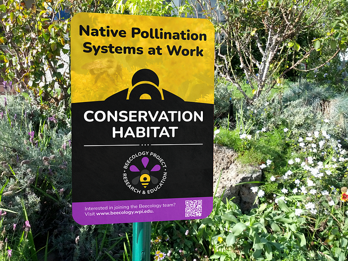
Leading up to today, we created a significantly different design and repeatedly iterated on it until Rob thought it was perfect. By providing iterative feedback over email down to the wording level, we are able to make a design that he is truly happy with (which makes us very happy!). So without further adieu, here’s how it turned out:

As you can see, we changed almost every part of our initial design. We retained the bumblebee image and the call to action bar, but integrated an entirely new layout with new elements.
Most prominently, we changed the background to a bipartite consisting of the yellow bumblebee image with a clean, black background. This allowed us to add new stylization with the silhouette of a bee flying upwards.
We emphasized the wording that Rob liked most with “Native Pollination Systems at Work” and “Conservation Habitat.” We also enhanced the Beecology Project identification by creating a nice circle wrap around the logo and carrying the purple and yellow color dichotomy throughout the length of the sign.

With this project, I learned a ton about both the similarities and differences between digital and physical designs. This included the importance of a design’s message and purpose, it’s promotion of it’s creator, and the relationship between making something aesthetically engaging and informationally accurate.
As such, we would like to extend a big thanks to Professor Robert Gegear on entrusting this design with us! We greatly appreciate the experience!
LAST BLOG: https://paradoxpyt.medium.com/3-10-21-making-big-changes-a82827850383