Going cross-platform
Over the week, we refined our design and reformatted it across multiple platforms.
After last week’s presentation, we received overall good feedback on our poster design. The main critiques included:
- The distance between the QR code and “Reserve your seats now!” created an unclear connection. This should be improved following the principle of proximity.
- The layout and sizing of the dates and time could be made simpler. The size differences between the information wasn’t appealing to our colleagues.
In addition to these critiques, there were areas that we also thought could be improved. These included things that would improve the technical design of the poster, as well as get us closer to the message we want to convey. In it’s current state, the poster is a little too happy and doesn’t accurately convey the disfunction of the play. We can do better.
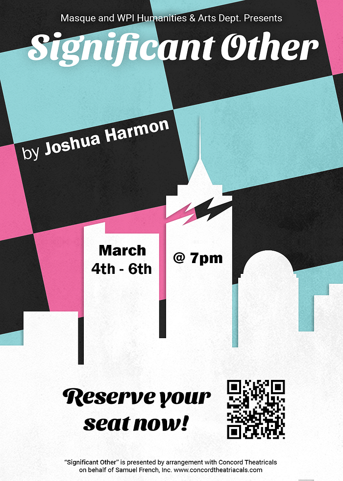
After using Illustrator to vectorize the background, spending more time on the city skyline, and rearranging the layout of elements, our poster design has a much more refined structure. By adding a strong building near the middle with a needle at the top, the poster has a proper flow from the top to the bottom.
We also added a fracture to this building to signify the chaos of Jordan’s situation and the divisions that develop between him and his friends. We think this adds more mystery and intrigue to the poster as well.
Per our client’s request, we also created versions of this poster for a Facebook event and an Instagram post. To show her how these would look like in person, we mocked them up on their respective platforms.

For the Facebook event, the poster had to be expanded to fit the landscape dimensions. To do this, we added more buildings to the skyline in each direction. We also removed the QR code information as a direct link could be provided within the event. Lastly, we chose the poster’s pink as the background gradient as it gives the event a complementary aesthetic to the poster.

For the Instagram post, the poster’s height had to be reduced to fit Instagram’s optimal portrait size; otherwise, it stayed the same. In this form, we think the colors will pop on people’s Instagram feed and will definitely be an attention-grabbing post.
These new designs and mockups will be the first thing our client, Olivia, will see of our design. Do you think she will like them? Find out next time on this blog detailing our design journey!


